As device deployments grow in size and complexity, visibility is needed to track the growth of devices, users and other critical data points. Whether you’re planning for the future or tracking a serious issue now, visualizations are a popular way that IT professionals keep their eye on the health of their environments. If a picture is worth a thousand words, a well-constructed dashboard is a novel that tells the story of your fleet’s present, past and possible future. Fortunately, Jamf provides extensive data points from which to build your dashboards. And we want to make it easy for you to get started.
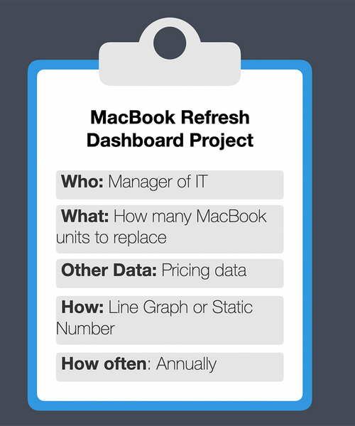
Before starting to design a dashboard, it’s important to plan your visuals around the questions that you are trying to answer. Far too often, admins are graph happy and end up with a mess that doesn’t tell a story or answer real questions. In our webinar, we discussed 5 questions that should be asked before beginning any dashboard project.
A little planning will go a long way to ensure you create impactful visuals for yourself, your colleagues and stakeholders within your organization.
After deciding what you want to show and what data is required, you’ll need to select a reporting platform that supports your data, presentation and delivery needs. If this information is primarily for yourself and encompasses primarily Jamf data, you might be well served by Jamf’s built-in reporting tools. If you have additional needs or data, there is a growing list of third-party tools that can aggregate data across multiples sources.
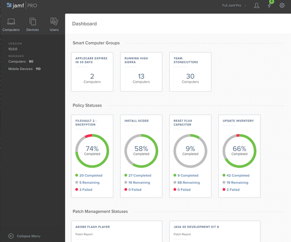
But let’s start with what you already have — Jamf Pro. Since Jamf Pro 10.0, admins have had the Jamf Pro Dashboard as the first thing they see when they sign in, and it’s easy to customize this screen to show counters or pie charts of policy completion. The dashboard supports reporting on smart computer and device groups, policies, configuration profiles, patch reports, licensed software and Public Key Infrastructure (PKI) information.
In addition to the dashboard, Jamf Pro admins can configure Jamf to send automated reports to any list of individuals on a predetermined interval. If your purchasing or asset teams need a monthly CSV that includes a subset of information within Jamf, this can be delivered automatically. The mobile and computer searches in Jamf Pro can be scheduled to run and export a variety of formats to fit your needs.
For organizations that need more flexibility or need to integrate numerous data sources, it’s worthwhile to explore third party reporting tools — many of which easily integrate with Jamf. The Jamf Marketplace is your home for products that connect to and expand on the capabilities of Jamf products. Reporting and BI tools are some of the most popular integrations and the fastest-growing category.
In the webinar, we addressed three of these tools:
Commonplace with organizations that need to parse large amounts of data, Splunk is the most flexible of Jamf’s reporting integrations. First published in October, Jamf’s Splunk app has received updates and positive reception from 1000+ combined downloads and installs.
This app makes it easier to connect Jamf Pro to Splunk, and our Reporting Series on YouTube goes into depth on setting up searches and advanced visuals.
Our good friends at Microsoft make Power BI, a tool that is tightly integrated into the rest of the Microsoft ecosystem. For anyone that’s ever used Excel to create a graph or visualization, Power BI will feel like a natural extension of these skills. A new feature called “Ask a question” allows you to format your search as a human-readable question and Power BI will suggest a query for you.
Microsoft included Jamf Pro as a native integration for Power BI in their February update, so you can get started easily.
Numerics by Cynpase is a KPI and dashboard built specifically for Apple devices. With pre-built integrations for 50+ cloud service, Numerics can easily connect with either Jamf Pro or Jamf School to make easy work of beautiful dashboards that can be viewed on iPhone, iPad, Apple TV, or as a complication on Apple Watch. Integration with Siri allows you to ask for your most important numbers.
Built with security in mind, Numerics is server-less and keeps your service account credentials securely encrypted locally on your device.
There’s more data than ever, but thankfully there are also more tools to help you make sense of it and take action. Whether you’re just getting started down your reporting path or data warehousing and visualization are a competency, there’s a Jamf reporting solution for you.
To help organizations get started we’ve compiled two resources:
1. Our YouTube Series with specific instructions for all sorts of reporting platforms.
2. A Jamf Nation community to share dashboards and get inspiration from others.
We will keep these resources up-to-date as well as look for your feedback. Make sure to check out the webinar in full here. Happy graphing!
Subscribe to the Jamf Blog
Have market trends, Apple updates and Jamf news delivered directly to your inbox.
To learn more about how we collect, use, disclose, transfer, and store your information, please visit our Privacy Policy.


